MS에서 새로운 폰트가 나왔다고 해서 받으러 갔는데, 설명에 이런 문구가 있습니다.
This is a fun, new monospaced font that includes programming ligatures and is designed to enhance the modern look and feel of the Windows Terminal.
https://github.com/microsoft/cascadia-code
ligatures 는 합자기능이라고 하네요. 2개의 글자를 하나로 합쳐서 간결하게 표시하는 방법이라고 하는데, 프로그래밍 쪽에서는 자주 사용하는 등호 같은 기호를 하나로 표기한다고 합니다. 지금 사용하고 있는 D2Coding 폰트에도 이런 기능이 포함되어 있다고 하네요.
엇. 그런데 왜 모르고 있었지, 싶었는데, 주로 사용하는 개발 도구에서 이를 지원하는 기능이 없었네요.
이게 뭔가 기능이기 때문에 이 기능을 활성화할지 여부를 개발 도구에서 지원해주어야 하고 지원해주는 경우에는 끄는 옵션도 제공한다고 합니다. 하여간 표시되는 형식은 폰트마다 다르긴 한데, 대충 아래와 같습니다.
왼쪽이 cascadia code이고 오른쪽은 맑은 고딕입니다.
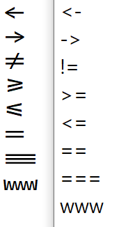
이렇게 사용하는 이유는 사실 프로그래밍에서는 2개 문자의 조합이 하나의 의미를 나타내기 때문에 좀 더 생산적이고 가독성 있는 코드를 만들기 위해 사용한다고 합니다.
Programmers use a lot of symbols, often encoded with several characters. For the human brain, sequences like ->, <= or := are single logical tokens, even if they take two or three characters on the screen. Your eye spends a non-zero amount of energy to scan, parse and join multiple characters into a single logical one. Ideally, all programming languages should be designed with full-fledged Unicode symbols for operators, but that’s not the case yet.
https://github.com/tonsky/FiraCode
tonsky/FiraCode
Monospaced font with programming ligatures. Contribute to tonsky/FiraCode development by creating an account on GitHub.
github.com
하지만, 여전히 기존 표기 형식이 익숙하기 때문에 기능을 끄는 옵션을 제공해야 하나 보네요.
이 기능 자체가 여러 문제를 가지고 있다는 이야기도 있습니다. 하지만, 이 자체가 하나의 문화가 된다면 되돌리기는 쉽지 않겠죠.
https://practicaltypography.com/ligatures-in-programming-fonts-hell-no.html
Ligatures in programming fonts | Butterick’s Practical Typography
Ligatures in programming fonts—a misguided trend I was hoping would collapse under its own illogic. But it persists. Let me save you some time— Ligatures in programming fonts are a terrible idea. And not because I’m a purist or a grump. (S
practicaltypography.com


